

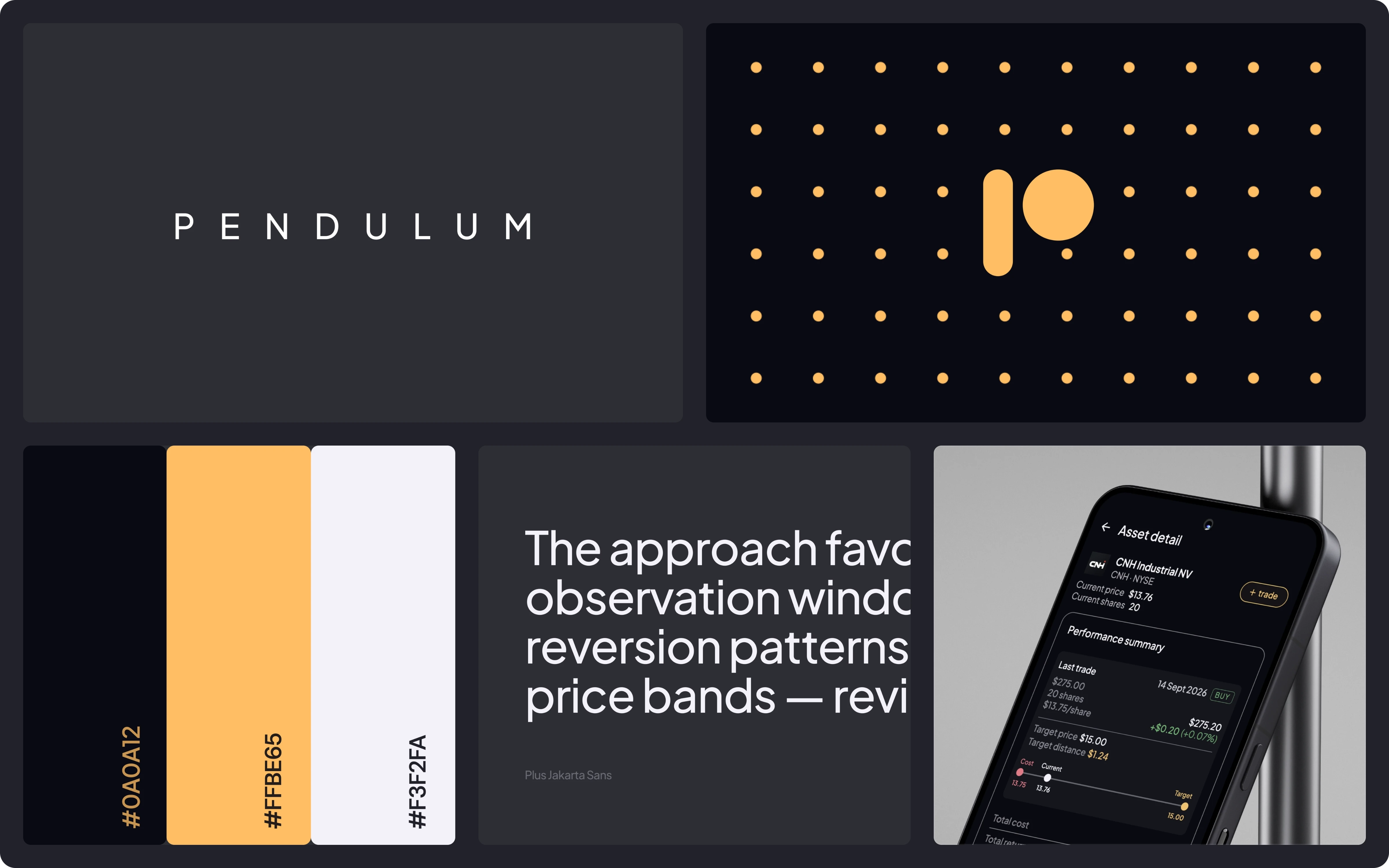
Mobile App
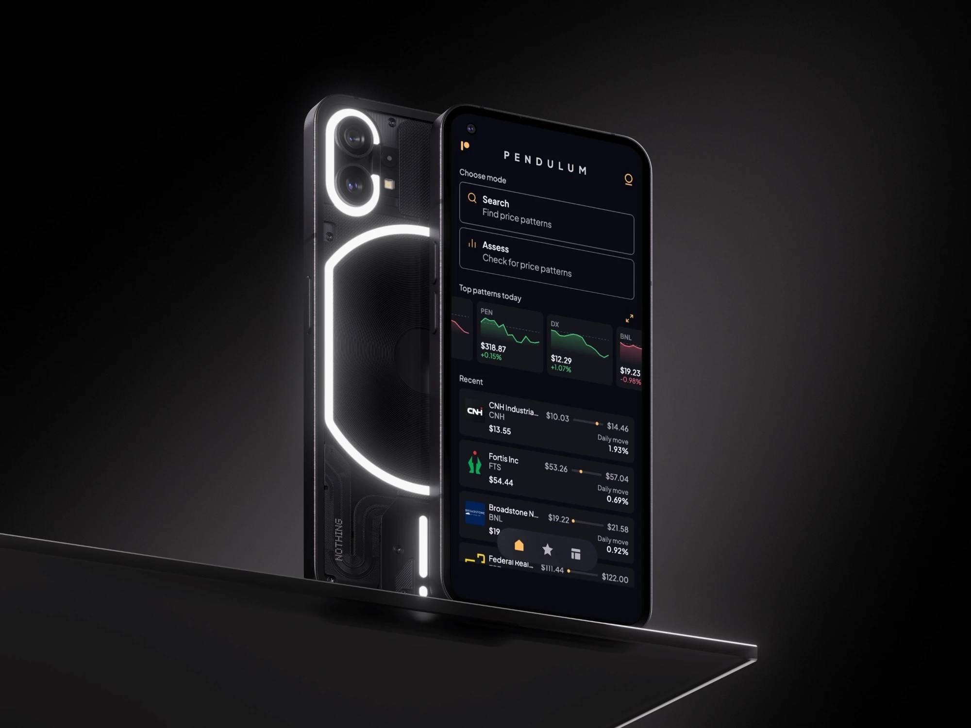
Pendulum is a stock filter based on mean reversion. It applies fixed screening rules to public market data and surfaces stocks whose prices have oscillated around a historical baseline. Users inspect how often specific price levels were reached over a chosen observation window.
THE PROBLEM
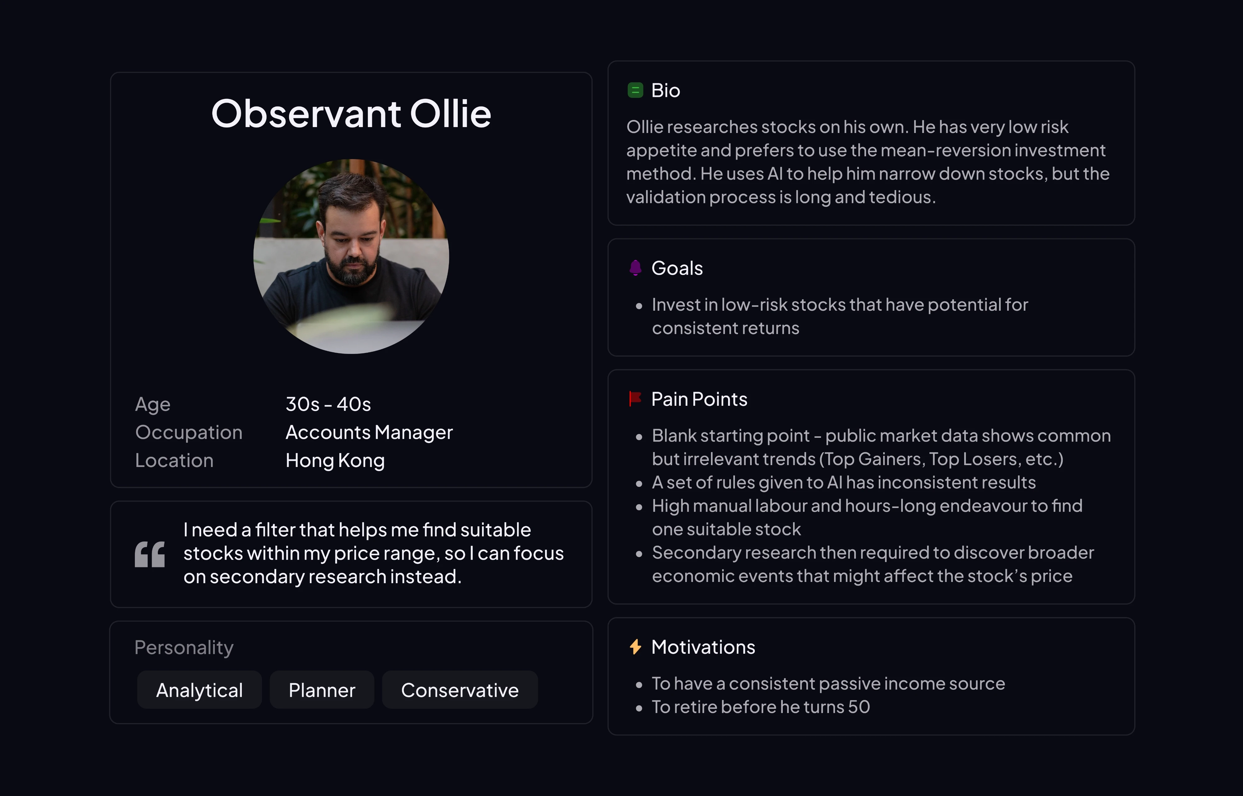
For non-professional investors who observe mean-reversion patterns, there is no starting point for a session. The first pass is often very manual and very tedious: scanning price history across dozens of stock symbols, judging whether a recent price dip still fit the mean-reversion pattern under observation or looked like a break in that pattern, and logging notes in a spreadsheet. They switch between browser tabs and a separate notes app. That workflow is slow, inconsistent, and unreliable.
The gap is not a missing feature inside an existing screening tool. Conventional screening tools filter on company financial metrics or on standard chart indicators — none support an observational question grounded in historical behavior: "Has this stock oscillated around a baseline in the past, and where does today's price sit within that pattern?"
Without that question answered systematically, each session opens on a blank page, with no repeatable way to identify candidates for secondary research.
THE SOLUTION
Pendulum was designed around this workflow gap and supplies the starting point.
Search mode returns stocks that fit mean-reversion rules within seconds, so observation doesn't begin from from zero. With the first pass handled, the remaining research time goes to what the filter doesn't cover: earnings dates, broader economic context, or short-selling activity. These are external factors that can disrupt a pattern regardless of what the historical data shows.
DATA ARCHITECTURE
Pendulum draws on public market data from third-party providers, including Alpha Vantage and Financial Modeling Prep. A proprietary rules engine on the backend applies fixed screening criteria to that data and writes results to a cached database refreshed on a daily schedule after the market close. The app runs on that cache, not live quotes. Search results shows a "Last updated on [date]" timestamp, and UX copy throughout the app frames results as observed rather than current.
PROCESS
This project combined traditional product design with an AI-native development loop — design thinking and journey mapping up front, then continuous build-test-iterate on live interfaces.
Phase 1 — Research & strategy
Problem framing — interviews on how people use screening tools today
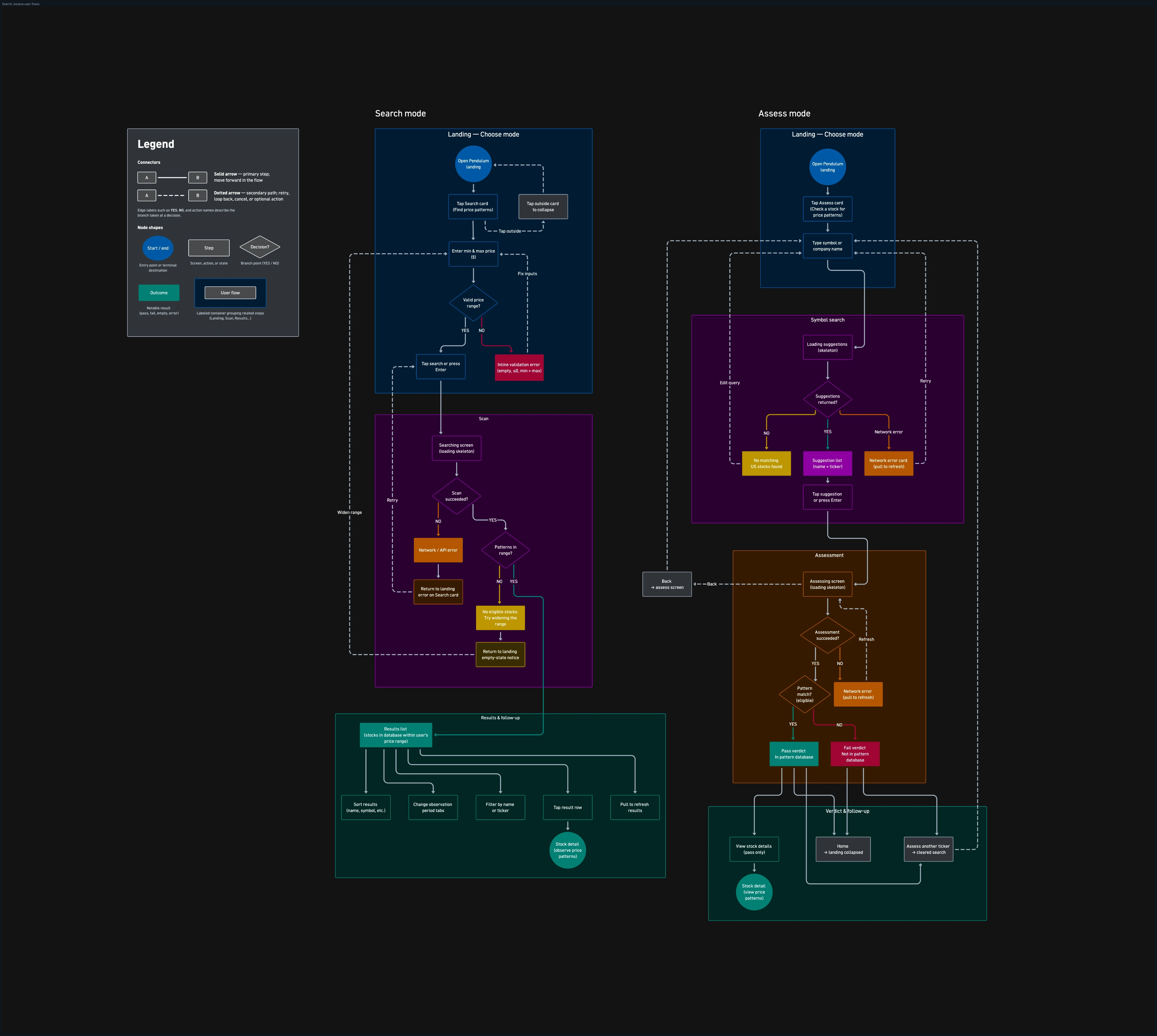
Journey mapping — Search vs. Assess as two entry paths to the same observational model
Content strategy — liability-safe voice aligned with onboarding caveats ("pattern detection, not stock stability")
Main feature roadmap — Search, Assess, Interactive price chart, Estimated profits calculator, Watchlist, Dashboard
Phase 2 — AI-native build workflow
Built primarily through Cursor, with Figma for design. Rather than long static handoff cycles, the product moved through a live build loop — small enough to ship fast, validated in local dev and on a physical device in the same session, then deployed to production when ready. There was no separate staging tier and no sprint handoffs.
Figma — Wireframes, hi-fi screens, component states, and chart interaction exploration.
Cursor — Translated Figma specs into working React/TypeScript in the Vite app. Prompted for component scaffolding, API client patterns, state management, and unit tests. For domain logic - the assessment rule presentation, chart gesture handling, off-track detection — the core was written directly; Cursor handled boilerplate, edge cases, and test generation.
Iterate on-device — Refine in browser on a mobile viewport, then verify in the Capacitor Android shell on a physical phone. Issues found in one session were fixed in the same session.
MAIN FEATURES
Pendulum is built around four surfaces that carry the research workflow from first pass to follow-up.
Search — takes a price band and observation period, then returns stocks whose historical patterns match fixed screening rules within that range.
Assess — runs the same rules against a single stock symbol and surfaces pass/fail results as informational context. Useful when the researcher already has a stock symbol in mind.
Watchlist — saves stocks for ongoing observation, including when a saved stock later falls outside the criteria that prompted the save.
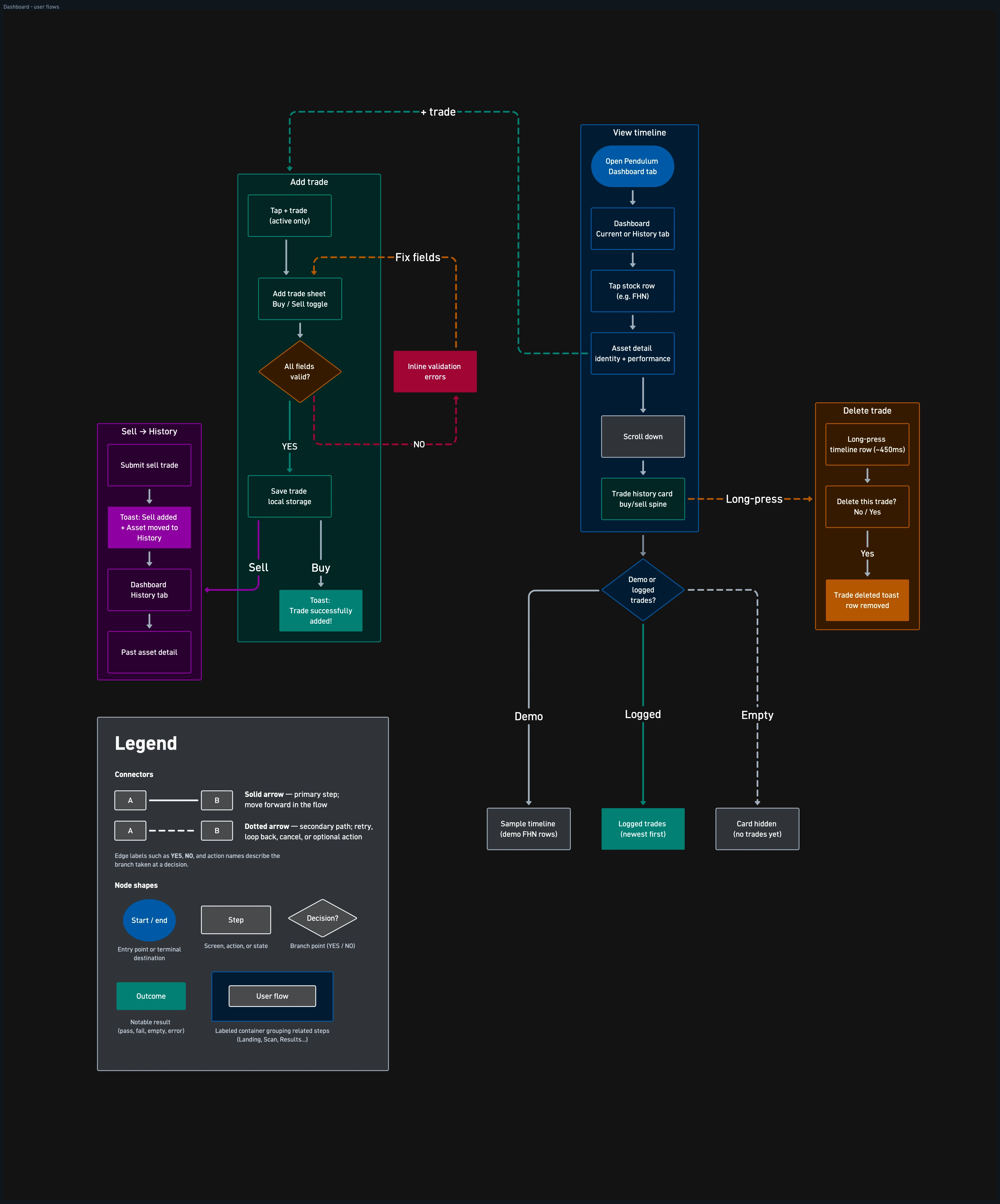
Dashboard — logs trades on a timeline so entries can be compared against the observed range for that position. Acts as a record for the researcher's own review, not a performance verdict.
Interactive price chart — shows how many times a price hits in days. Dragging along the price chart replaces static explanation and gives instant historical trends.
Estimated profits calculator — allows users to calculate estimated profit by stock or by capital without needing to navigate away to a separate app. Users can refer directly to the interactive price chart located above the calculator.
DESIGN DECISIONS
Caveats before features in onboarding
Onboarding
The onboarding sequence leads with the observational frame — what the app does, what it doesn't, what "pass" means — before showing any feature demos. If a first-time user sees "Search" before understanding that outputs are historical pattern matches, they form the wrong mental model in the first 10 seconds. I rejected the standard "features first, caveats in a Learn More link" pattern because the cost of a misread (treating a pattern match as a buy signal) outweighs the cost of a 30-second onboarding.
No rating semantics on results rows
Search · Assess
Search and Assess results display a binary pass/fail label — not a score. The moment a row shows a number, the user reads it as a quality signal rather than a pattern match, which is the exact misread the product is designed to prevent. I considered a confidence percentage during Figma exploration but cut it because it shifted the user's question from "does this match?" to "is this a good trade?"
Expandable landing cards
Search · Assess · Landing/Home
Search and Assess inputs live inside a card on the landing screen that expands in place to reveal the fields. A mode switch or separate screen would imply the two entry paths are different products; an expandable card says "same place, different inputs." I rejected a persistent always-visible form because it made the landing screen read as a settings page rather than a starting point.
Scan timing visible on every results surface
Search · Assess · Watchlist
"Last updated on [date]" appears within header section on the 'search results' screen and 'top patterns today' screen — not in a tooltip or settings page. The app runs on a cached, daily-refreshed dataset, so without a visible timestamp the user can't distinguish today's data from yesterday's, and the "observed, not current" framework loses credibility. Without it, a user might act on data they believe is current but isn't.
Chart as the primary interaction surface
Stock detail
The stock detail screen leads with the interactive price chart and the drag-to-probe gesture, not a stats block. Touch frequency is the feature no other tool offers; burying it behind a tab makes the differentiator a footnote. I rejected a stats-first layout (the default in most stock apps) because the numbers are what you get from any screener — the chart interaction is what you can't get elsewhere.
Off-track label, not push notification
Watchlist
A watchlist stock is flagged with a badge when its price no longer meets any one of the rules that prompted the save. The user checks on their own schedule; a push notification would create urgency the observation frame doesn't support. I accepted the risk that the flag sits unseen for days because the alternative would position the app as an alerting tool.
IMPACT
Research time per session dropped from >5 hours to seconds, as reported by beta users. Through beta testing, the filter reached zero false positives. Beta users confirmed the starting-point value: stocks surfaced by the filter matched what they would have identified manually, but in a fraction of the time.
UPCOMING FEATURES
Product roadmap informed by beta feedback:
iOS build — in progress. Same Figma specs, SwiftUI implementation. Closes the platform gap for the beta group's iPhone users.
Real-time short-interest data — beta users discovered that the results could not indicate short-selling. Incorporating Fintel API solves this need.
Notifications — buy trades include a user-set target price. When current price is within 1% of a target price, users will receive a notification.
Pendulum is a stock filter for mean reversion, not a recommendation engine or an advisory party. It provides the structured first pass that was missing — so the remaining research begins from a defined starting point rather than a blank page.
Pendulum is a stock filter based on mean reversion. It applies fixed screening rules to public market data and surfaces stocks whose prices have oscillated around a historical baseline. Users inspect how often specific price levels were reached over a chosen observation window.
THE PROBLEM
For non-professional investors who observe mean-reversion patterns, there is no starting point for a session. The first pass is often very manual and very tedious: scanning price history across dozens of stock symbols, judging whether a recent price dip still fit the mean-reversion pattern under observation or looked like a break in that pattern, and logging notes in a spreadsheet. They switch between browser tabs and a separate notes app. That workflow is slow, inconsistent, and unreliable.
The gap is not a missing feature inside an existing screening tool. Conventional screening tools filter on company financial metrics or on standard chart indicators — none support an observational question grounded in historical behavior: "Has this stock oscillated around a baseline in the past, and where does today's price sit within that pattern?"
Without that question answered systematically, each session opens on a blank page, with no repeatable way to identify candidates for secondary research.
THE SOLUTION
Pendulum was designed around this workflow gap and supplies the starting point.
Search mode returns stocks that fit mean-reversion rules within seconds, so observation doesn't begin from from zero. With the first pass handled, the remaining research time goes to what the filter doesn't cover: earnings dates, broader economic context, or short-selling activity. These are external factors that can disrupt a pattern regardless of what the historical data shows.
DATA ARCHITECTURE
Pendulum draws on public market data from third-party providers, including Alpha Vantage and Financial Modeling Prep. A proprietary rules engine on the backend applies fixed screening criteria to that data and writes results to a cached database refreshed on a daily schedule after the market close. The app runs on that cache, not live quotes. Search results shows a "Last updated on [date]" timestamp, and UX copy throughout the app frames results as observed rather than current.
PROCESS
This project combined traditional product design with an AI-native development loop — design thinking and journey mapping up front, then continuous build-test-iterate on live interfaces.
Phase 1 — Research & strategy
Problem framing — interviews on how people use screening tools today
Journey mapping — Search vs. Assess as two entry paths to the same observational model
Content strategy — liability-safe voice aligned with onboarding caveats ("pattern detection, not stock stability")
Main feature roadmap — Search, Assess, Interactive price chart, Estimated profits calculator, Watchlist, Dashboard
Phase 2 — AI-native build workflow
Built primarily through Cursor, with Figma for design. Rather than long static handoff cycles, the product moved through a live build loop — small enough to ship fast, validated in local dev and on a physical device in the same session, then deployed to production when ready. There was no separate staging tier and no sprint handoffs.
Figma — Wireframes, hi-fi screens, component states, and chart interaction exploration.
Cursor — Translated Figma specs into working React/TypeScript in the Vite app. Prompted for component scaffolding, API client patterns, state management, and unit tests. For domain logic - the assessment rule presentation, chart gesture handling, off-track detection — the core was written directly; Cursor handled boilerplate, edge cases, and test generation.
Iterate on-device — Refine in browser on a mobile viewport, then verify in the Capacitor Android shell on a physical phone. Issues found in one session were fixed in the same session.
MAIN FEATURES
Pendulum is built around four surfaces that carry the research workflow from first pass to follow-up.
Search — takes a price band and observation period, then returns stocks whose historical patterns match fixed screening rules within that range.
Assess — runs the same rules against a single stock symbol and surfaces pass/fail results as informational context. Useful when the researcher already has a stock symbol in mind.
Watchlist — saves stocks for ongoing observation, including when a saved stock later falls outside the criteria that prompted the save.
Dashboard — logs trades on a timeline so entries can be compared against the observed range for that position. Acts as a record for the researcher's own review, not a performance verdict.
Interactive price chart — shows how many times a price hits in days. Dragging along the price chart replaces static explanation and gives instant historical trends.
Estimated profits calculator — allows users to calculate estimated profit by stock or by capital without needing to navigate away to a separate app. Users can refer directly to the interactive price chart located above the calculator.
DESIGN DECISIONS
Caveats before features in onboarding
Onboarding
The onboarding sequence leads with the observational frame — what the app does, what it doesn't, what "pass" means — before showing any feature demos. If a first-time user sees "Search" before understanding that outputs are historical pattern matches, they form the wrong mental model in the first 10 seconds. I rejected the standard "features first, caveats in a Learn More link" pattern because the cost of a misread (treating a pattern match as a buy signal) outweighs the cost of a 30-second onboarding.
No rating semantics on results rows
Search · Assess
Search and Assess results display a binary pass/fail label — not a score. The moment a row shows a number, the user reads it as a quality signal rather than a pattern match, which is the exact misread the product is designed to prevent. I considered a confidence percentage during Figma exploration but cut it because it shifted the user's question from "does this match?" to "is this a good trade?"
Expandable landing cards
Search · Assess · Landing/Home
Search and Assess inputs live inside a card on the landing screen that expands in place to reveal the fields. A mode switch or separate screen would imply the two entry paths are different products; an expandable card says "same place, different inputs." I rejected a persistent always-visible form because it made the landing screen read as a settings page rather than a starting point.
Scan timing visible on every results surface
Search · Assess · Watchlist
"Last updated on [date]" appears within header section on the 'search results' screen and 'top patterns today' screen — not in a tooltip or settings page. The app runs on a cached, daily-refreshed dataset, so without a visible timestamp the user can't distinguish today's data from yesterday's, and the "observed, not current" framework loses credibility. Without it, a user might act on data they believe is current but isn't.
Chart as the primary interaction surface
Stock detail
The stock detail screen leads with the interactive price chart and the drag-to-probe gesture, not a stats block. Touch frequency is the feature no other tool offers; burying it behind a tab makes the differentiator a footnote. I rejected a stats-first layout (the default in most stock apps) because the numbers are what you get from any screener — the chart interaction is what you can't get elsewhere.
Off-track label, not push notification
Watchlist
A watchlist stock is flagged with a badge when its price no longer meets any one of the rules that prompted the save. The user checks on their own schedule; a push notification would create urgency the observation frame doesn't support. I accepted the risk that the flag sits unseen for days because the alternative would position the app as an alerting tool.
IMPACT
Research time per session dropped from >5 hours to seconds, as reported by beta users. Through beta testing, the filter reached zero false positives. Beta users confirmed the starting-point value: stocks surfaced by the filter matched what they would have identified manually, but in a fraction of the time.
UPCOMING FEATURES
Product roadmap informed by beta feedback:
iOS build — in progress. Same Figma specs, SwiftUI implementation. Closes the platform gap for the beta group's iPhone users.
Real-time short-interest data — beta users discovered that the results could not indicate short-selling. Incorporating Fintel API solves this need.
Notifications — buy trades include a user-set target price. When current price is within 1% of a target price, users will receive a notification.
Pendulum is a stock filter for mean reversion, not a recommendation engine or an advisory party. It provides the structured first pass that was missing — so the remaining research begins from a defined starting point rather than a blank page.
Services
Services
Product Designer
Product Designer
AI-native build
AI-native build
Year
Year
2026
2026